Klarna
Reimagining how millions of users manage what they owe — with one flexible payment flow, rebuilt for every market and product.
Role
Senior Product Designer
Type
FinTech
Consumer Payments
Timeline
10 Months (2024)


The Problem
Payment management had fragmented across markets and products — users couldn't tell if they'd paid, find their bank details, or do simple things like pay for a single order.
What I Did
Designed a single, flexible payment flow that adapts to any user, product, or market — grounded in real usage data and user testing, then pivoted mid-project after a company-wide UI redesign priority landed from leadership.
The Outcome
+10% payment completion, -0.5s per payment, reduced ongoing development effort across markets.

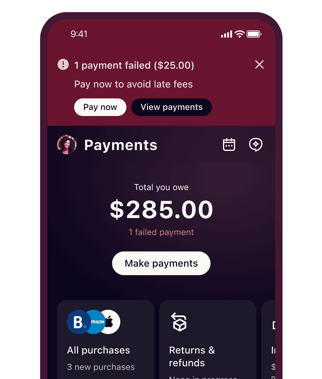
Klarna's payment experience had grown fragmented across markets
Different flows for checking what you owed, extending a due date, or paying for a single order, shaped more by history than by what people actually needed. User research said it plainly: people didn't know if they'd paid, couldn't find their bank details, couldn't pay for just one thing. The data pointed to something simpler than the complexity suggested — over 90% of users have just one to three purchases and use a single payment method — so I designed one flexible flow that adapts to any user, product, or market instead of maintaining separate ones per market.


Early testing validated the bet: a 10% lift in payment completion, less development effort. But it also cost something — simplifying the view reduced visibility in ways that hurt upsell, and the added speed introduced some confusion. Midway through, that work collided with a company-wide priority to redesign the entire app under a new UI style. I pivoted fast — bringing back a step I'd cut, directly responding to what testing had taught me — and shipped under the new timeline without lowering the design-to-development bar.


The lesson stuck: simplifying something well means knowing exactly what you can afford to take away, and what you can't.